When you look at a BuddyPress profile page on a full width page with no sidebar when using a WordPress default theme like Twenty Sixteen it looks a lot better than when viewing in a Genesis starter theme…
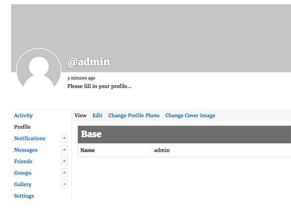
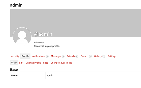
So out of the box the Genesis theme loses the navigation layout structure of what can be achieved, as in the Twenty Sixteen theme, which is much cleaner.
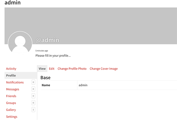
All that really is different is a CSS class when using a full width layout, Genesis uses .full-width-content whilst BuddyPress default CSS uses .no-sidebar, so you just have to override the relevant BuddyPress CSS rules in your theme’s CSS using the .full-width-content CSS Class instead…..
@media screen and (min-width:55em) {
 body.full-width-content #buddypress #item-body,body.full-width-content #buddypress #item-header {
 background:#fff
 }
 body.full-width-content #buddypress #object-nav,
 #buddypress #object-nav {
 border-right:1px solid #ddd;
 float:left;
 margin-right:-1px;
 width:200px
 }
 body.full-width-content #buddypress #object-nav ul {
 background:0 0;
 border-bottom:0;
 padding:0
 }
 body.full-width-content #buddypress #object-nav ul li {
 float:none;
 overflow:hidden
 }
 body.full-width-content #buddypress #object-nav ul li span {
 background:#fff;
 border-radius:10%;
 float:right;
 margin-right:2px
 }
 body.full-width-content #buddypress #item-body {
 border-left:1px solid #ddd;
 overflow:hidden;
 padding:0 0 0 20px;
 width:auto;
 }
 body.full-width-content #buddypress #item-body #subnav {
 margin:0 0 0 -20px
 }
 body.full-width-content #buddypress #item-body #subnav ul {
 margin-top:0
 }
}
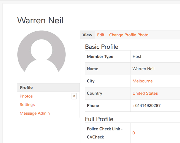
Giving us…
Removing the Cover Image Background
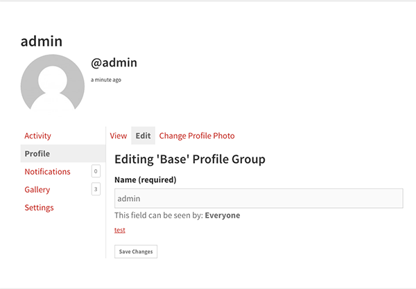
If you don’t want the large cover image as a background you can remove that with…
// Remove BP Cover Image
 add_filter( 'bp_is_profile_cover_image_active', '__return_false' );
 add_filter( 'bp_is_groups_cover_image_active', '__return_false' );
Which you can add in your functions.php – giving us…
Using Flexbox to control the layout
The last thing I want to do is tidy up the avatar header and primary navigation so they sit in a sidebar that I can control as a flexbox container, currently the mark up is…

Using BuddyPress hooks you can contain the item-header and item-nav with (also in functions.php)…
add_action('bp_before_member_home_content', 'prefix_add_sidebar_opening');
 // Add in Sidebar Div
 function prefix_add_sidebar_opening() {
 echo '<div class="sidebar-buddy-nav">';
 }

add_action('bp_member_options_nav', 'prefix_add_sidebar_closing');
 // Add in Sidebar Div Closing
 function prefix_add_sidebar_closing() {
 echo '</div>';
 }
Giving mark up…
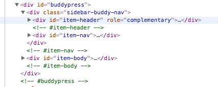
So now you can easily control the sidebar elements in a flexbox container, as well as the sidebar itself and the main .item-body by using flexbox properties on the outer div with the ID of buddypress. The sidebar you can flow as a column and the outer layer which is the sidebar and body you would flow as a row.
@media screen and (min-width:768px) {

	.profile #buddypress,
	.media #buddypress,
	.bp-user #buddypress  {
	        display: flex;
	        flex-flow: row wrap;
	        justify-content: center;
	}

	.sidebar-buddy-nav{
		width: 25%;
	}

	body.full-width-content #buddypress #item-body {
		width:75%;
	}

	body.full-width-content #buddypress #object-nav,
	#buddypress #object-nav  {
		border-right:1px solid #ddd;
		float:left;
		margin-right:-1px;
		width:100%
	}

		#buddypress div.item-list-tabs ul li {
		float: left;
	}

}
This will make layout and source order easy to control.









2 comments
Gilly
How do I get the full with on genesis??
Gabriele
Hi, I’m trying to apply this to a non-Genesis theme and actually work pretty well with some small tweak but I don’t know nothing about flexbox so I’m a bit lost in the last part of the tutorial: please can you share the css for achieving the final result where the avatar header and primary navigation in sidebar flow as a column and the outer layer flow as a row?
Many thanks