Here’s how you can make a full width header with a background image in WordPress’ latest default theme ‘Twenty Sixteen’.
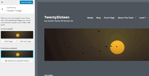
So above I have just chosen the color scheme as grey and added a header image, which just sits the image below the the site title and menu – maybe you want the image as a background image instead behind the site title and menu and also to go full width. This will utilise the header space.
CSS Containers
First up is to remove the controlling site-inner containers CSS and then set the same max width on the site-content, site-header-main and site-footer. So you’ll need to add this at the end of your style.css
Header Markup
Next up is to remove the .header-image div that contains the image and then set a background CSS rule to .site-header so the header image sits behind it still using the uploaded file via the customizer – this uses the get_header_image function. The CSS background rule also is setting the image to not repeat and focuses on the center of the image.
Below is the changed header.php file
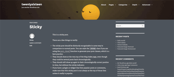
Now it should resemble something like the below – which we still need to add some more CSS to control how it fills the space, how deep you want it and add some margin in front of the content.

Header CSS
So this is also added in your style.css with the other snippet, the first rule background-size covers the area, the min-height will set the minimum depth this will depend on how much of the image you want to show and finally just a bit of margin to separate the main content.
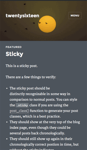
Now you should have something like the below.
Changing the Default Header Size
You can also change the Twenty Sixteen default header image size by adjusting the width and height values in the /inc/customizer.php file from line 53
 add_theme_support( 'custom-header', apply_filters( 'twentysixteen_custom_header_args', array(
 'default-text-color' => $default_text_color,
 'width' => 1600,
 'height' => 200,
 'flex-height' => true,
 'wp-head-callback' => 'twentysixteen_header_style',
 ) ) );
Adjust the width and height for a new image to suit, or if you don’t want to change the original theme file you can use the filter twentysixteen_custom_header_args and add the change in your functions.php
You certainly want to do it this way if you have a parent/child set up so you preserve your changes on any parent update.


36 comments
Steve
Hi Neil,
Great tutorial. You have helped me out numerous time, especially with Genesis-related modifications.
Today, I am working on the default WordPress Twenty Sixteen theme. I have used the code you provided above to change the default header size. I put the code in the functions.php file and it works great. The problem is the header image shows up on every page and I only want it on the home page.
I have tried using the code below in the functions.php file but it does work.
if (is_home()) {
// This is a homepage
} else {
// This is not a homepage
}
My question is what php code to I need to add to functions.php so the header image only shows up on the home page?
Thanks again for all your help.
– – Steve
Trevor
Hi Neil,
Great tutorial, worked perfectly. Is it possible to align the title/menu along the bottom of the header image? If I attempt to change the position in CSS (relative) the title cuts off after 20 or so px. It seems there’s a certain window it can be placed in. I can use absolute position but then if the window size changes it doesn’t align with the bottom consistently. Is there a way to more dynamically align the title and menu bars to the bottom? Thanks!
Trevor
MO Abdali
Thank you, it work for me
Leva mundos
Hi!
Great tutorial, and nice codes for turning over a basic theme to a nice theme. The code worked but i can’t change the height on the header or the menu, neither in the PHP or in the style.css under the site-header. Ive tried margin-bottom, top bottom, height, min and max height but nothing seems to affect it.
How do i do this?
Again, great tutorial!
Neil Gowran
The header height can be changed with by changing the min-height value
.site-header {

    background-size: cover !important;

    min-height: 600px;

    margin-bottom: 20px;

}
For the menu height – I would change the padding on the link tag
@media screen and (min-width: 56.875em)

.main-navigation a {

    outline-offset: -8px;

    padding: 1.5em 0.875em;

    white-space: nowrap;

}
sjoerd vogelzang
my problem is exactly as in the demo. Used all the full width codes but still (like in the demo) the header is wider than the content.
How to get this the same ??
kietygory
Thanks for the code for header image. It works fine.
I want the feature image to have full width, but cannot get it. Can you help me?
My site is: http://www.scandinaviansolution.com
WordPress topic is here:
https://wordpress.org/support/topic/twenty-sixteen-full-width-featured-image/
Bastian
Hi Neil,
thank you for sharing your skills.
Actually i want to redesign my familyblog based on the Twentysixteen Theme.
I did everything like you explain it, but with that functions.php my Site just show a “white wall” :)
 $default_text_color,

		'width'                  => 1600,

		'height'                 => 200,

		'flex-height'            => true,

		'wp-head-callback'       => 'twentysixteen_header_style',

	);

		return $array;
?>
Can you explain me the error?
Regards from Germany,
Bastian
Neil Gowran
You are missing a closing curly brace
return $array;}
Bastian
http://testblog.bastian-oelkuch.de/wp-content/uploads/2016/08/functions.html
Bastian
Sorry for the reply, but wordpress didn’t take the whole code.
Here you can see the complete code.
Julie
Hi Neil,
I love the ability to have a full-width header in 2016. Thanks for that!
The issue I have is that I had to tweak it to get the menu under the header and now I have a full-width header that is not responsive. I posted in the WorPress.org forum:
https://wordpress.org/support/topic/how-to-move-menu-below-header-image?replies=7#post-8631789
but have not had any responses. I credited your code as having got me part way. Any help to make it responsive would be appreciated!
Neil Gowran
Answered on the WP thread
Moleboge Matotoka
Thank you, this worked out perfectly for me. But the site-header then hides my site-logo. Any ideas what i can do to change that?
Tina Dubinsky
Hi Moleboge,
In the header.php file, add
Line 31
after
Line 30
I compared the old header.php with the new header.php and saw this was missing. Adding it back worked for me and hasn’t caused any issues, however you might want to check if it looks okay on other devices such as mobile (I haven’t checked yet and it may be why it was left out).
Neil – Thanks for the code to make a full width header. It’s much appreciated.
sjjstar
I’m wondering if anyone can help me. I’m trying to customize my header image load on one specific page where all the other pages have the header image random from a choice of four different options thorough the customizer. How do I load one specific header image on just one of the pages so the images are not random on this page but they are random on all of the other pages?
Angela
Hi. This worked beautifully, but where would I put the code in my child theme to MOVE the menu below the header image?
Thanks!
Raielene Langdon
I ran into the same issue, Angela. Did you find a solution?
Kashif Asrar
Thank You very much , the tutorial is very much helpful for novices like me , you can watch my blog as well.
It would be more convenient if you had added that slider in your tutorial , at the same place with same condition , i hope i make sense.
Thanks and Regards,
Florian Neukirchen
Thanks a lot, this really helped me to tweak the design of my Website to look the way I wanted.
Karen Rempel
Thank you, your instructions were very helpful. I got the exact results you promised, and am very pleased!
Neil Gowran
Great – glad it worked out for you!
Andrea Marzano
Hi there,
I followed all the instructions but I cannot make the header’s height smaller. help please….
Mohammad
Thank you very much, it worked like a charm and you helped me understand how headers work.
Things I modified: is moving the (center no-repeat) attributes of .site-header from the header.php to the css file. Also I used 100vh as the height of .site-header because I want the header to cover the whole screen, please advise if you think there is a better practice to achieve that
Also I don’t understand why did you limit the width of .site-header-main to 1320px, isn’t it better to use 100% or 100 vw ?
Neil Gowran
Hi Mohammad – thanks for the feedback -yes moving the background position value to CSS is the cleaner way, I limited the width of .site-header-main purely for my own aesthetic reasons, sometimes content spread full width over a certain size seems unbalanced, all subjective though :)
FRUSTATED SOMEONE
i dont understand. all this is like japanese jargon.
why wordpress being more than 20% of the internet, can’t be more USER FRIENDLY.
i mean, drag, drop, adjust, drag, adjust, click,click this on, click that off. ready, click publish, bam lets got out dinner with s.o.
simple , basic stuff,
wordpress must deliver a simple drag and drop , boxed layout. c,mon where in 2016!!!!!!! not evolution at all
seems that this is all prehistoric computer era science.
WHERE I PUT THOSE CSSSSSSSSSS STUFFF “css containers” WHERE ARE THOSE THINGS
WHERE DO I CLICK TO PUT THAT &^%^&%^&%^& CODE
whyyyyyy
Neil Gowran
You always have other easier options – you can use Square Space or Wix – but you will run into issues also when you want to change something that the theme or template can’t do out of the box – this post and blog in general is for people that understand a bit of html, css and php.
If you don’t understand some of those things ( and you shouldn’t have to) just pay someone to do the work for you.
It’s like any trade if you are not a mechanic don’t go messing with your engine.
Rick
Thanks Niel!
Unlike what is shown on your tutorial, the site header appears in the middle of my background image.
How is the site header moved to the top?
Alex de Vulder
Hi,
I’ve done everything shown in your post but the header is still tyhe same width.
Like here: http://www.rikkivanderschoot.com/wp/
Can you tell me please what i’ve done wrong? TIA
Alex
Alex de Vulder
I’ve already resolved this item. Thank you.
dbjdbj
Hi,
All is a dandy theme is great but…
Layout is somewhat “hopelessly” narrow. Also in 2016 “single view” .entry-footer “goes” left of .entry-content.
Like here: http://dbjdbj.org/2015/06/08/what-we-exactly-do-for-you/
Which all makes 2016 almost unusable for 2 column “page builder” layouts, and a such.
My “fear” is to change this involves non-trivial page.php , production.
New “full width” page/post template will solve all of this.
Any isntant cook book recipe perhaps, would be nice :)
Neil Gee
This may help – https://wpbeaches.com/full-width-single-posts-in-twenty-sixteen/
Neil Gee
The .entry-footer goes full width and below the content when the viewport is less than 985px
موفقیت
It was good thanks
Sean Vandenberg
Cool, Neil. I hadn’t actually check out Twenty Sixteen yet – looks pretty nice! Good post, dig the PHP skills.
Neil Gee
Thanks Sean, most of the changes are CSS but yes there are some important PHP functions for the header in there – TwentySixteen is a well designed mobile first theme but I needed to adjust the header for one of my projects.