Getting full width pages in Genesis – Its colorful and long and goes on and on and on – sales landing pages.
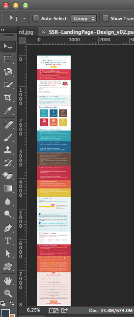
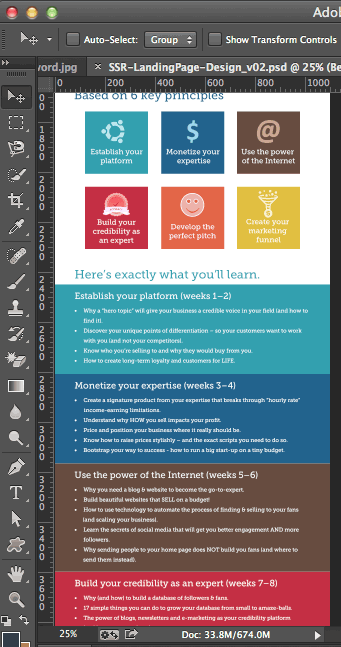
To create these types of full width pages in a Genesis child theme you need to edit the CSS for the inner part of the page and then create some new CSS which you can add in multiple sections that expand the width of the page with the content inside being centered, pretty much like what happens in the header area.
Editing the CSS
The inner part of the page is controlled by the CSS class .site-inner which is set to be 1140px wide and centred.
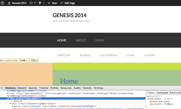
If we change this CSS rule where it appears to have no width or padding attributes in the CSS it will go full width, and if you want this to appear on certain pages then it makes sense to take advantage of Genesis Custom Body Class Field in the post editor – give it a class like full-width, then in your style.css add…
.full-width .site-inner {
max-width: none;
}

@media only screen and (max-width: 1023px) {
.full-width .site-inner { padding-left: 0%; padding-right: 0%; }
}
We get..
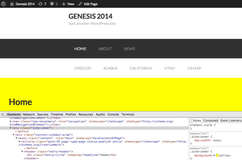
The content goes edge to edge.
Adding the New HTML Mark Up Containers
For each segment on the page that is unique, the content needs to be contained in 2 div elements, the inner one to house and centre the content and the outer one to control the containing or wrapping div element that go full width of the page. Add the mark up directly onto the WordPress page.
<div class="container container1">
	<div class="content content1"></div>
</div>
<div class="container container2">
	<div class="content content2"></div>
</div>
<div class="container container3">
	<div class="content content3"></div>
</div>
<div class="container container4">
	<div class="content content4"></div>
</div>
These divs should have a common and unique class some styles are shared and others are unique.
CSS Rule
.content {
max-width:960px;
margin: 0 auto;
}
The key CSS rule is to set a width on the content div it needs to be defined either as an absolute figure in pixels or a relative figure in percent and centered with the margin rule.
The outer div classes can be used for background colors and images

This can also come in handy with a page builder like Beaver Builder, just by setting the custom body class on the desired pages you can build full width pages easily.






2 comments
Alicia
I didn’t find where I should put the html code in the landing-page.php?
Matt Miciula
Thanks for sharing the full width landing page css. I am certain others will also find it helpful.