I find that I always, well most of the time, use the header right widget area in Genesis for the Primary Menu of a site and create this menu by adding a Custom Menu to the Header Widget Area, whilst there is nothing wrong by doing it this way, there is a better way.
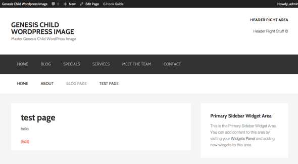
Here is a guide how to place the Primary Menu in the Header Widget Area by just moving its location there permanently via a Genesis hook. The benefit of doing this is that out of the box the location is set and you have more functionality with registered menus. So to go from this…
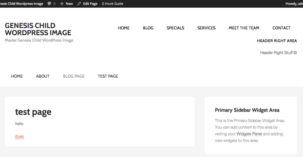
To this…
All the code goes in the themes function.php file
You can actually just add the remove_action and add_action functions at the beginning of the code and that alone will reposition the menu. The remove_action moves the menu away completely and the add_action adds it to the new location.
But I also want to modify the output of the menu by removing the wrap element it has by default. This is done by not declaring support for that element in the wrap list. The wrap list is originally declared in genesis/lib/init.php lines 62-64. So to leave one (or more out) just add the theme support without the element
add_theme_support( 'genesis-structural-wraps', array( 'header', 'menu-secondary', 'footer-widgets', 'footer' ) );
Add in some CSS
Add to your style.css which reverses the colors of the original menu and also sets the last link to have no padding so it sits flush right and aligns with the content below it.
.nav-primary {
	background-color:#fff;
}
.nav-primary li a{
	color:#000;
}
.nav-primary a:hover, .nav-primary .current-menu-item > a {
	color:#666;
}
.nav-primary a:last-of-type {
	padding-right:0px;
}


13 comments
Gretchen Louise
This worked well on a site using Foodie 1.0.0 but it made the mobile menu below the header unclickable. Any trick to making sure the mobile menu still works?
Thank you!
di sekitar
hi neil,
If I want to move “secondary menu” to top right corner what code should I use?
Because I need the “primary menu” on it’s original location.
Danielle Frappier
Nice trick! Thank you. I was hoping to use this to move menu-secondary rather than the primary. I changed you code to the below code but it only moved primary.
remove_action( ‘genesis_after_header’,’genesis_do_nav’ ) ;
add_action( ‘genesis_header_right’,’genesis_do_nav’ );
add_theme_support( ‘genesis-structural-wraps’, array( ‘header’, ‘menu-primary’, ‘footer-widgets’, ‘footer’ ) );
Brittney
Hi! I changed the code in my functions.php file and ended up with two menus on the top, neither of which are displaying properly. I also went to appearance – edit CSS and pasted the code you said there and nothing happened. You can see how it’s being displayed on my website. How do I fix this?
Neil Gowran
I can only see one menu on your website – if you have removed the code – then the issue maybe that the theme you have used already has moved the menu to a different hook – so the remove_action won’t do anything – you will need to find out what hook the menu is currently hooked in and remove that instead.
Tamara
Hello,
Great tutorial! I found it very helpful and easy to understand. I’d like my nav to function the same as the one on this site. I implemented your code and it looks like great (yay) but I can’t understand why it won’t “stick” when you scroll down like yours… Any advice would be VERY much appreciated!
Thanks for your time!
Neil Gee
I am sticking mine with some CSS – you can try adding the below CSS and see how you go…
.admin-bar .site-header {top: 32px;
}
.site-header {
left: 0;
min-height: 61px;
position: fixed;
top: 0;
width: 100%;
z-index: 999;
}
Tamara
You my friend are awesome! That is exactly the start I needed!
Thank you SO much!!
Peter
Nice, thanks!
Rui
Hey Neil, very nice trick! By switching the menu to the header right area will it still be responsive for mobile and tablet users?
Neil Gee
Sure it will change with narrower viewports or you’d just hook in a mobile menu like slick nav.
Gina
Great solution, but the nav is still wrapped in the aside element, isn’t it?
Neil Gee
It certainly is, alternatively Gary Jones has a plugin that has it wrapped in the nav as the top level container.