This guide uses a jQuery mobile responsive menu from Josh Cope and shows how you can use it for a mobile menu in a Genesis Child theme in WordPress.
There is also a guide for regular WordPress themes here.
Also I have made a plugin which will work on Genesis and regular WordPress themes.
SlickNav mobile menu is supports all modern browsers and IE7+, works on iOS Safari and Android and can handle multi-level sub-menus. You can also add it to multiple menus and position these to various HTML elements on the page by altering some options in the jQuery variables.
Add in the Core jQuery and CSS
You can download and install the JS and CSS files or use them via jsdelivr
Download the latest release from Github, then expand the archive and get jquery.slicknav.min.js and slicknav.css – move these files into place in your theme…
jQuery
/wp-content/themes/YOURTHEME/js/
folder and name it jquery.slicknav.min.js
CSS
/wp-content/themes/YOURTHEME/css/
folder and name it slicknav.css
Register the jQuery and CSS Files Locally in Genesis
Enqueue the Javascript and CSS in your functions.php file:
function themeprefix_scripts_styles() {
 wp_enqueue_script('slicknav', get_stylesheet_directory_uri() . '/js/jquery.slicknav.min.js', array( 'jquery' ),'1.0.5',false );
 wp_enqueue_style('slicknavcss', get_stylesheet_directory_uri() . '/css/slicknav.css','', '1.0.5', 'all' );
}
add_action( 'wp_enqueue_scripts', 'themeprefix_scripts_styles' );
…Or Register the jQuery and CSS in Genesis via a CDN
Enqueue the Javascript and CSS in your functions.php file:
function themeprefix_scripts_styles() {
 wp_enqueue_script('slicknav', '//cdn.jsdelivr.net/jquery.slicknav/1.0.5/jquery.slicknav.min.js', array( 'jquery' ),'1.0.5',false);
 wp_enqueue_style('slicknavcss', '//cdn.jsdelivr.net/jquery.slicknav/1.0.5/slicknav.css','', '1.0.5', 'all');
}
 add_action( 'wp_enqueue_scripts', 'themeprefix_scripts_styles');
Set the jQuery to fire
In functions.php also add in some jQuery triggers to fire on the main menu:
// Add Responsive SlickNav to a designated menu
function themeprefix_responsive_menujs() {
	echo 	"<script>
			jQuery(function($) {
			$('#menu-main-menu').slicknav();
			});
			</script>";
}
add_action ('genesis_after','themeprefix_responsive_menujs');
The jQuery selector above is using the ID of the <ul> as highlighted, change that to the Menu ID that you wish to target or Class.
Show/Hide the Menus in CSS
Here is the CSS to add in your regular CSS file. It sets the menus to hide/display depending on the viewport breakpoint – adjust your px in your style.css
/*CSS Menu Style*/

.slicknav_menu {
	display:none;
}

@media screen and (max-width:600px) {
	/* #menu-main-menu is the original menu */
	#menu-main-menu {
		display:none;
	}

	.slicknav_menu {
		display:block;
	}
}
Set the pixel width when you want the mobile menu to fire, the above example is set to 600px and is set inside a media query. The selector before the media query hides the slick nav menu at larger viewport size and displays the regular navigation. The CSS selector inside the media query is the ID of the menu <ul>, change that to the Menu ID that you wish to target.
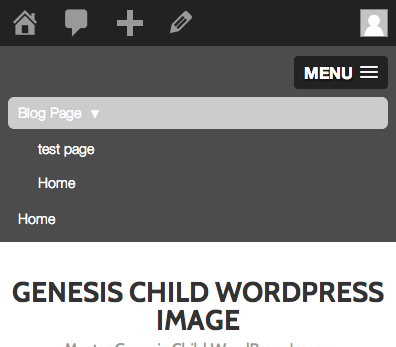
Viewing on Mobile

jQuery Options
There are a few options you can add into javascript to change a few things, here are a couple:
label:'Footer Menu',
duration: 400,
prependTo:'.site-footer',
So in the above the the label will set the name of the Menu, default is ‘MENU‘, the duration is the speed of the dropdown, default is 200, higher numbers make it slower.
The prependTo allows you to position the menu to a different part of the page similar to hooks in Genesis, the default HTML element is <body> which will sit at the top of the page, to change this you just pass in a HTMl element that is present on the page.
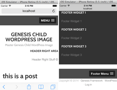
Firing Multiple Menus
In the example below, 2 menus are targetted for the Slick Navigation responsive menus, one in the header and one in the footer
//Responsive Nav
function themeprefix_responsive_menujs() {
	echo 	"<script>
			jQuery(function($) {
			$('#menu-main-menu').slicknav();
			$('#menu-footer-menu').slicknav({
					label:'Footer Menu',
					duration: 400,
					prependTo:'.site-footer',
				});
			});
			</script>";
}
add_action ('genesis_after','themeprefix_responsive_menujs');
So in this example the header menu #menu-main-menu is using the slicknav defaults but the #menu-footer-menu has a different label, opening/closing speed and is located in the .site-footer.
Remember to add the additional menu IDs to the CSS to show/hide the menus
Further CSS Styling
To further style the navigation just edit the slicknav.css
Full Gist
I have created a SlickNav Menu plugin that has options that you can change from within the WP Admin Dashboard.


45 comments
Paty
I am a beginner, I have a Hueman theme, and I need the word MENU to show on the side of the hamburger lines on the Mobile menu. How do I do that?
Carlo S
Great plugin and works like a charm with Genesis. I had two questions:
1) I would like to put some text (eg: Call 888-555-1212) on the left side of the Responsive Menu row. How would I be able to do this? I realize I can check off “Hide Main Header”, but I would rather keep this intact and be able to just add additional text on the Responsive Menu row.
2) It would be great to add icons to the main categories in the responsive menu. Any advice on how to accomplish this with your existing code?
Thanks again in advance, and keep up the great tutorials and updates on the plugin!
Cheers
Carlo
Neil Gowran
There is an option in the latest version of the plugin to add text that appears opposite the Menu icon, as to icons for menu items – that will need to be done via CSS.
Carlo
Hi Neil,
Appreciate the reply, and what you said worked like a charm! Thanks!
One other possible bug I came across is when I use the search in your SlickNav, and results come back on the following page, the SlickNav gets replicated. In other words, I have two menus after the search page has come back. Do I have something wrong setup, or is this a possible bug?
Thanks again for all your help!
Cheers
Carlo
Neil Gowran
That shouldn’t happen, check this websites mobile menu to see default behaviour, perhaps you have some left over code from the manual slicknav tutorial?
Okechukwu Solomon
Please help me on how to add brand logo to it and remove the “MENU” before the 3 line button. Looking forward to see your reply. Thanks
Neil Gowran
You can do both in the plugin!
Christine
Thank you a million times over! I’ve been trying to implement a mobile menu on a from scratch Drupal 8 theme (modules that are ported are few and far between). This is the only solution that has worked for me. Thank you for the clear instructions!
Neil Gowran
Cool, haven’t tried Drupal 8 yet, great that it works there too.
Danielle Frappier
These tutorials are great! Thank you for sharing them.
I have a question about modifying what you did here slightly. Is there a way to have the secondary nav roll up into the menu too? I tried the code below, however that made two menu rather than rolling both menus into one hamburger menu.
// Add Responsive SlickNav to a designated menu
function eh_responsive_menujs() {
echo ”
jQuery(function($) {
$(‘#menu-main-menu, #menu-top-menu’).slicknav();
});
“;
}
add_action (‘genesis_after’,’eh_responsive_menujs’);
Neil Gowran
Hi Danielle – you can do this either via the plugin https://wordpress.org/plugins/slicknav-mobile-menu/ I did or via code – example here http://codepen.io/ComputerWolf/pen/tjyIg
Danielle Frappier
Hi Neil,
The code pen you shared worked perfectly! Thank you so much!
Terrie
Hi there,
I’ve used this plugin on several sites…love it! But now, I have a new challenge. I’m working on a one-page site and have a menu with anchor links. I would LOVE for the menu to collapse on item click since the page is scrolling to an anchor and I don’t want the menu to continue to display. Is this possible?
I’m using Genesis/Dynamik and even tried to use the built-in responsive menu with some custom js I found, but can’t get it to work. Would much rather use SlickNav.
Thanks!
Neil Gowran
You can do this, if you open slick-init.js in the js folder of the plugin and add on line 35:
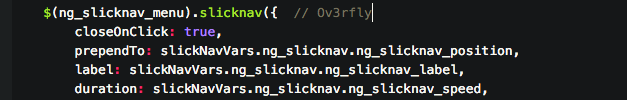
closeOnClick: true,I will add this as an option in the next update.
Jessie
How can I turn off the expanding mechanics? So for desktop view we want the expanding menus, showing subpages. But for mobile we only want to show the main nav items. I’ve hidden them with CSS/media queries, but that doesn’t change that once touched, the menu item doesn’t take the user to that page, rather it’s still trying to expand the menu.
Peninah
Thank you! This was so clear and simple to use. Much appreciated!
Cao
Hi
Tried installing to have the Primary menu to be responsive.
I tried changing the menu-main as required to: #menu-primary-nav, nav-primary, etc, and a few other combinations.
Can you tell me what this: should be changed to for the primary menu?
/* #menu-main-menu is the original menu */
#menu-main-menu {
It just doesn’t work as is.
Thanks!
Neil Gee
Would have to see the code to say – do you have a link?
Marvin Forte
Spoke too soon. I figured it out:
allowParentLinks:true
in the .js file.
Marvin Forte
Thanks for the great information and content. The menu is working great for me with one exception. If there’s a page with no sub-pages, then clicking on the menu takes me to that page. But, if there’s a page with sub-pages, I can’t click on the parent page itself (only the sub-pages). How can I fix this?
Monique
When activating this plug-in (version 1.6.0) I am getting ‘Parse error: syntax error, unexpected T_STRING in /x/x/x/x/x/x/slicknav-mobile-menu/slicknav-mobile-menu.php on line 1’ … suggestions?
Thanks!
Neil Gee
Hi Monique, for the latest version I am using some modern PHP standards that require a minimum version of PHP 5.3.0, if you are using PHP 5.2.X the plugin will fail – but the older versions will be ok.
WordPress now recommends running PHP 5.4.X, any webhost should really be running something higher, you may even have the option your self in the control panel to select a higher version.
Terrie
Hi Neil,
Plugin is working beautifully. Now, I need to add an additional menu that will replace the default menu on a specific template page (replaces primary with secondary). I have successfully replaced the full size menus on the template, but not having luck firing a second slicknav. I know this is pretty advanced so any help/links you can provide would be appreciated. I’ve researched but can’t find anything similar to what I want to do!
Example of primary menu: http://www.cogneurosociety.org/wordpress2015
Example of secondary menu: http://www.cogneurosociety.org/wordpress2015/annual-meeting
Thanks!!
Rich
Love the plugin however I’ve been trying to get it to sit level with the logo on this website.
I’ve tried various options in the “Menu Position” box but it either ends up above or below. Ideally I want it to end up on the right (in the middle) with the logo on the same line on the left.
Any suggestions?
Thanks
Neil Gee
Hi – Have responded here – https://wordpress.org/support/topic/move-menu-in-line-with-logo
Amit Ramani
I have been using your Genesis Child Theme from github. When I try using this plugin, I do not see any Mobile optimized menus on my cellphone (Android Samsung Galaxy S4). I have tried both ID and Class CSS Selectors for the “Slicknav Mobile Menu Name” field.
What am I doing wrong?
The site is http://www.tacknrider.com
Neil Gee
Hi – you may have to use latest version of the theme where all SLickNav functions are removed from theme (as now I recommend using plugin instead) – you can try and just replace the functions.php file with the latest version from GitHub – if you send me your functions.php file – I can remove what is not required and resend it to you.
Aaron
I’m in the same boat. I am running your child theme, not the latest version, but one with slick-nav as a grayed out recommendation, and the plugin but it doesn’t load the plugin at any width.
any ideas?
Neil Gee
Would need to see the code to have an idea – do you have a link – also check there are no js errors in the console.
aaron
Thanks! That cleared it right up. The wording made me think it was asking for the id of the mobile menu, not of my current menu. Sorry for the duplicate comment. I seem to be having issues. I am really enjoying your genesis theme btw.
aaron
Hmm I posted my response to this several days ago, but I guess something went wrong.
Anyways, I have a demo set up at fertilitysnapshot.com. I couldn’t find any console errors, save for the analytics tracking code, which was expected.
Any help would be appreciated. Thanks!
aaron
Sure. I put a demo of the site up at http://www.fertilitysnapshot.com. I checked the console and the only issue I see is with the google analytics js file.
I would have responded sooner, but I never got a notification that you responded. I’ll just check back periodically for your response.
Thanks!
Neil Gee
You are using the wrong CSS ID – it should be
#menu-standard-menuyou currently have#slicknavTerrie Addobati
I love this and it’s working great!! One question: I’m working on a site and trying to position the slick menu under the header (where the primary menu is), instead of at the top. Using Genesis/Dynamik and the Slick plugin, and tried to add this to custom functions but it didn’t work:
add_action ( ‘genesis_after_header’,’themeprefix_responsive_menujs’ );
Here’s the URL:
http://www.cogneurosociety.org/wordpress2015/
Thanks!
Neil Gee
You can try the plugin I created – it has a Menu Position option that may work for you – https://wordpress.org/plugins/slicknav-mobile-menu
Terrie
Thanks Neil!
I’m actually using the plugin but completely missed this option in settings.
Although I have to admit I’m still a little confused how I can change the position via a css class. Seems like I would need to hook it after the header. Can you clarify?
Much appreciated!
Neil Gee
Hi Terrie – the position can be changed by using a CSS class/ID of an element which is preferably full width – in this example http://coolestguidesontheplanet.com/ narrow the viewport below 600px and you will see the Menu appear lower down – if you look at the source code it is appearing in a full width div with a class of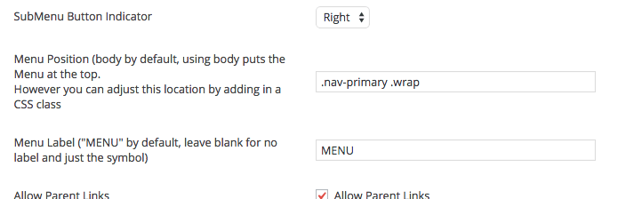
.nav-primary .wrap. The value of.nav-primary .wrapis put into the settings of the plugin.- Hope that makes senseTerrie
Perfect! That did it. Thanks so much!
Jessie
This is just what I was looking for, and had it running in 5 min. Thank you!
Rehman
Great work , i just need m menu will open from left to right how it will be?? in current time it top to bottom.
Neil Gee
Better off using Sidr for off canvas stuff like that.
Jane
Do you know how the code is adjusted for underscores?
Neil Gee
Hi Jane – the only thing you should need to change is the genesis_after hook for wp_head then it will work on any theme
John
Yeah, this is awesome… much better, not to mention easier and faster, than the alternatives. Nice!
Beau
Great instructions and works fast and looks great. Thanks!!