Styling buttons in Beaver Builder can be quite a lengthy and tedious task and if a change has to be done over many pages the task becomes more onerous.
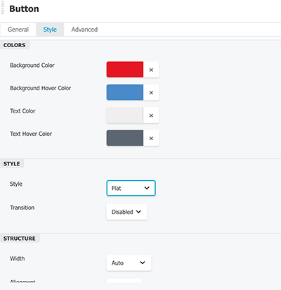
The Builder Module UI covers most aspects of the style but is missing elements such as borders and shadows and the RGBA color model for colors. So instead of using the Module control fields – use a CSS snippet, it’s faster and you completely control the style.
Style Buttons Using CSS Snippet
Here is a snippet that I use for buttons in the builder.
/* # Buttons - Black-Button example
 * Apply the CSS class to a module or row .black-button
---------------------------------------------------------------------------------------------------- */

.fl-builder-content .black-button a.fl-button,
.fl-builder-content .black-button a.fl-button:visited,
.fl-builder-content .black-button .fl-slide a.fl-button,
.fl-builder-content .black-button .fl-slide a.fl-button:visited  {
	background: #000;
	border: 1px solid #000;
	color: #fff;
	border-radius: 1px;
	padding: 7px 35px;
}
.fl-builder-content .black-button a.fl-button:hover,
.fl-builder-content .black-button a.fl-button:focus,
.fl-builder-content .black-button .fl-slide a.fl-button:hover,
.fl-builder-content .black-button .fl-slide a.fl-button:focus  {
	background: #fff;
	border: 1px solid #000;
	color: #000;
}
.fl-builder-content .black-button a.fl-button *,
.fl-builder-content .black-button a.fl-button:visited,
.fl-builder-content .black-button .fl-slide a.fl-button *  {
	color: #fff !important;
}
.fl-builder-content .black-button a.fl-button:hover *,
.fl-builder-content .black-button a.fl-button:focus * {
	color: #000 !important;
}
You can either put this CSS snippet in your child themes style.css file or the Customizer’s > Additional CSS or for just certain pages in the Builder > Tools > Layout CSS.
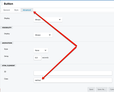
Then you add the CSS class ‘.black-button‘ in the above example to a Button Module or Rows Advanced Class fields.
In terms of the CSS snippet itself, it will cover buttons created via the button module and the content slider module, to make additional CSS styles just copy and repeat the code block and change the CSS style name eg .red-button – then change your styles in particular the foreground and background color selectors and apply the new CSS style selector to the modules you want changed.


1 comment
Brian
That all worked for me – after I removed the ‘dot’ from the class name!
Thanks.