How to create a full width header and footer in WordPress’s responsive Twenty Twelve theme. Example Site.
Create a Child Theme
First up you should really create and work from a Child Theme
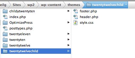
Make Header and Footer Copies to Child Theme
Copy your header.php and footer.php files from twentytwelve to your twentytwelvechild theme folder. Your Child Theme structure should be like so:
Making The Header Full Width
To make this clear – by making the header full width we are going to keep the header content centered in the middle of the page and surround it in a full width container that goes edge to edge to the viewport/browser window.
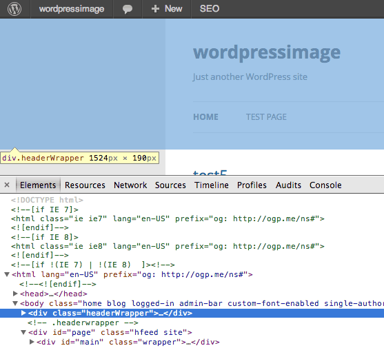
The header element with an ID of masthead and its parent div needs to be wrapped in a width-less container. The new wrapper div and its immediate child div need to be closed and a new page centering div opened at the end of the header.php file.
The content of header.php below the closing </head> should be:
<body <?php body_class(); ?>>
 <div class="headerWrapper">
 <div class="headerContent site">
 <header id="masthead" class="site-header" role="banner">
  <hgroup>
   <h1 class="site-title"><a href="<?php echo esc_url( home_url( '/' ) ); ?>" title="<?php echo esc_attr( get_bloginfo( 'name', 'display' ) ); ?>" rel="home"><?php bloginfo( 'name' ); ?></a></h1>
  <h2 class="site-description"><?php bloginfo( 'description' ); ?></h2>
  </hgroup>
 <nav id="site-navigation" class="main-navigation" role="navigation">
  <h3 class="menu-toggle"><?php _e( 'Menu', 'twentytwelve' ); ?></h3>
  <a class="assistive-text" href="#content" title="<?php esc_attr_e( 'Skip to content', 'twentytwelve' ); ?>"><?php _e( 'Skip to content', 'twentytwelve' ); ?></a>
 <?php wp_nav_menu( array( 'theme_location' => 'primary', 'menu_class' => 'nav-menu' ) ); ?>
 </nav><!-- #site-navigation -->
<?php $header_image = get_header_image();
 if ( ! empty( $header_image ) ) : ?>
 <a href="<?php echo esc_url( home_url( '/' ) ); ?>"><img src="<?php echo esc_url( $header_image ); ?>" class="header-image" width="<?php echo get_custom_header()->width; ?>" height="<?php echo get_custom_header()->height; ?>" alt="" /></a>
 <?php endif; ?>
 </header><!-- #masthead -->
 </div><!-- .headercontent -->
 </div><!-- .headerwrapper -->
<div id="page" class="hfeed site">
 <div id="main" class="wrapper">
Applying the CSS Tweaks –
@import url('../twentytwelve/style.css');

body .headerContent {
margin-top:0px;
margin-bottom:0px;
overflow:visible;
}
body .site {
box-shadow:none;
}

#page {
margin-top:0px;
}
To make the header sit snug to the head of the page and reduce spaces below, you need to add in a couple of CSS rules as above to your style.css file, this will make it appear as below.
Styling the Header Wrapper
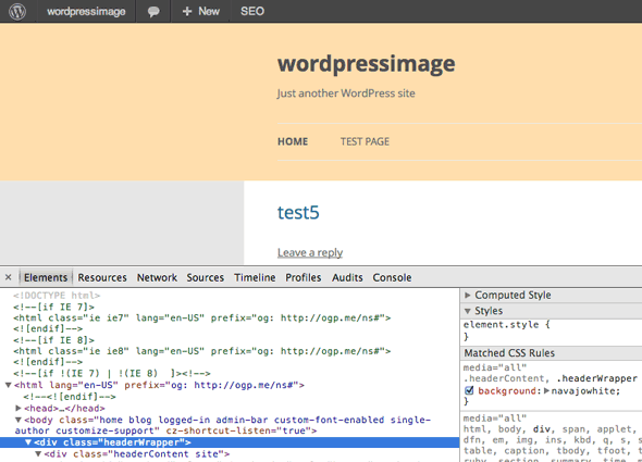
To style the headerwrapper and headercontent – use the 2 CSS classes below to make your background across the full width – so a beige background would be.
.headerContent, .headerWrapper {
background:navajowhite;
}
Making The Footer Full Width
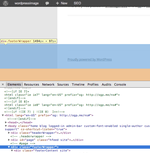
Same deal with the Footer by making the footer full width we are going to keep the footer content centered in the middle of the page and surround it in a full width container that goes edge to edge to the viewport/browser window. What is done is the opposite of what was done to the header. The changes made here include ending the main page container before the footer – create a new width-less footerWrapper and then a content centering footerContent div using the pre-existing site class to centre the content.
So the new footer.php content would be
<?php
/**
 * The template for displaying the footer.
 *
 * Contains footer content and the closing of the
 * #main and #page div elements.
 *
 * @package WordPress
 * @subpackage Twenty_Twelve
 * @since Twenty Twelve 1.0
 */
?>
	</div><!-- #page -->
	</div><!--#main .wrapper  -->
	<div class="footerWrapper">
		<div class="footerContent site">
	        <footer id="colophon" role="contentinfo">
		<div class="site-info">
			<?php do_action( 'twentytwelve_credits' ); ?>
			<a href="<?php echo esc_url( __( 'http://wordpress.org/', 'twentytwelve' ) ); ?>" title="<?php esc_attr_e( 'Semantic Personal Publishing Platform', 'twentytwelve' ); ?>"><?php printf( __( 'Proudly powered by %s', 'twentytwelve' ), 'WordPress' ); ?></a>
		</div><!-- .site-info -->
	</footer><!-- #colophon -->
		</div><!-- .footerContent -->
</div><!-- .footerWrapper -->

<?php wp_footer(); ?>
</body>
</html>
Some CSS Styling to Fix things
body .site {
margin-bottom:0px;
}
body .footerContent {
margin-top:0px;
}
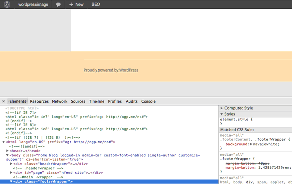
.footerWrapper {
margin-bottom: 48px;
margin-bottom: 3.428571429rem;
}
footer[role="contentinfo"] {
border-top: none;
}
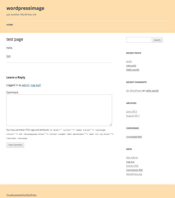
Giving us…
Styling the Footer Wrapper
To style the footerWrapper and footerContent – use the 2 CSS classes below to make your background across the full width – so a beige background would be.
.footerContent, .footerWrapper {
background:navajowhite;
}
Giving Us…
Making The Page The Same Color
To get rid of the box affect and have continuous colour throughout the browser you can do in 2 place, in the Theme background option…
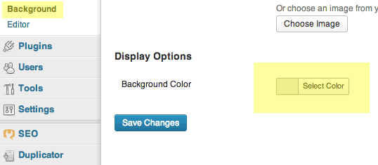
Or add in via your CSS file:
html body.custom-background, body {
background-color: #fff;
}


1 comment
ticadawn
This works great! Can you tell me how I could keep the header fixed? When I try, It messes with the format.
Thanks so much!!!!!