If you have the Beaver Theme as your WordPress theme, here is how you can add Bootstraps Collapse effect to a Beaver Builder row or module can be achieved using the Bootstrap data-toggle and data-target attribute.
You need to have the full bootstrap enabled in the theme, not the minimal version.
Let’s say you have a button which when clicked reveals a module below it and another click hides the module again. As below…
ExamplePellentesque habitant morbi tristique senectus et netus et malesuada fames ac turpis egestas. Vestibulum tortor quam, feugiat vitae, ultricies eget, tempor sit amet, ante. Donec eu libero sit amet quam egestas semper. Aenean ultricies mi vitae est.Mauris placerat eleifend leo. Quisque sit amet est et sapien ullamcorper pharetra. Vestibulum erat wisi, condimentum sed, commodo vitae, ornare sit amet, wisi. Aenean fermentum, elit eget tincidunt condimentum, eros ipsum rutrum orci, sagittis tempus lacus enim ac dui.
Donec non enim in turpis pulvinar facilisis. Ut felis. Praesent dapibus, neque id cursus faucibus, tortor neque egestas augue, eu vulputate magna eros eu erat. Aliquam erat volutpat. Nam dui mi, tincidunt quis, accumsan porttitor, facilisis luctus, metus
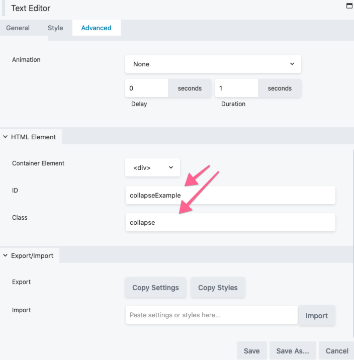
Create the button in a HTML module and give the button a data-toggle=”collapse” attribute and a data-target of data-target=”#collapseExample”
<a data-toggle="collapse" data-target="#collapseExample" href="#" role="button" aria-expanded="false" class="fl-button">Show Me</a>
Then in the text module below add a class of collapse and id of #collapseExample
Add some CSS for Beaver Edit Mode
Typically the module/element we are hiding will be hidden in the Beaver Builder edit mode- so some CSS is needed…
.fl-builder-edit  .collapse:not(.show) {
    display: block;
}
Data Attributes
If you want to use the actual button module instead of a HTML module for the button link, you can’t as one of the limitations is the module cannot have the data-toggle attribute added. You can add data-attributes with a plugin or by code, but they add the attribute to the fl-module not the element, but handy to know all the same.
You can add some CSS to include some toggle items:
a[aria-expanded="true"]::after {
	content: '\f077';
	font-family: 'Font Awesome 5 Free';
	font-weight: 900;
	color: #32407b;
	font-size: 13px;
	margin-left: 5px;
}

a[aria-expanded="false"]::after {
	content: '\f054';
	font-family: 'Font Awesome 5 Free';
	font-weight: 900;
	color: #32407b;
	margin-left: 5px;
	font-size: 13px;
}
Via Javascript
Another way to do this effect is via Javascript instead of data-attributes, still give both elements the href, class and ID values – then add some jQuery in a document ready function.
jQuery(".fl-button").click(function(){
    jQuery(".collapse").collapse('toggle')
});
So we are targetting the button or link with the class of .fl-button and the target has a class of .collapse
If you don’t have Bootstrap and alternative approach is to use jQuery SlideToggle.


1 comment
Chris Johnston
Awesome article! I actually figured this out today on my own, and thought, “I should write an article on how to do this.” So I checked to see if any articles had already been written, and low and behold! Cheers on the .fl-builder-edit
.collapse:not(.show) {display: block;} snippet. I didn’t have that, and it will certainly make things easier. ]
A couple of comments…
You can indeed add some simple code to use the button module, (or in my case, the icon module) as your trigger. Just need to slightly modify this snippet: https://community.wpbeaverbuilder.com/t/add-download-attribute-to-a-button/10226
So I added the class “collapse-trigger” to my Icon module (also works with the button module) and then here is my modified code:
jQuery(document).ready(function(){
jQuery( “.collapse-trigger a”).attr( “data-toggle”, “collapse” );
});
This works great, but I decided to take it a step further. The bootstrap documentation suggests also adding the following attributes to the trigger:
role=”button” (add this if you’re not actually using an html button, which applies to the button or icon module)
aria-expanded=”false” (something to do with screen readers)
aria-controls=”collapseExample” (something to do with screen readers)
So I figured what the heck, and I added them as well. In order to add multiple attributes to the attr() function, you’ve got to enclose everything inside {}. So here is my final code:
jQuery(document).ready(function(){
jQuery( “.collapse-trigger a”).attr( {“data-toggle”:”collapse”,”role”:”button”,”aria-expanded”:”false”,”aria-controls”:”collapseExample”});
});