A sticky footer refers to a web page footer that sticks to the foot of the page even when there is not a lot of content on the page, without one the footer will ride up leaving the layout somewhat unsightly.
There are various methods to add a sticky footer, some javascript and others CSS, you can add a sticky footer to a Beaver Theme layout with some CSS rules.
/* Sticky Footer */

.fl-page {
	position: relative;
	min-height: 100vh;
	padding-bottom: 60px; /* Should be equal to the height of your footer */
}
.fl-page-footer-wrap {
	width: 100%;
	position: absolute;
	bottom: 0px;
}
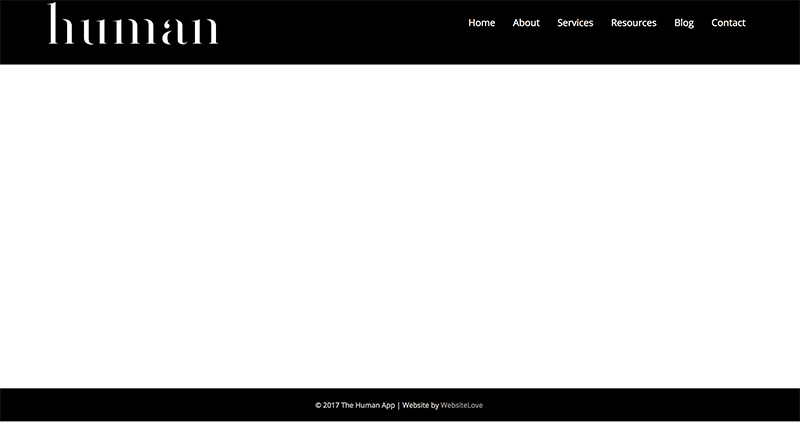
This will push down the footer to the bottom of the viewport.
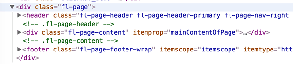
As long as the Beaver Theme follows the default structure this CSS will work – so the .fl-page is the parent of .fl-page-content and both that and the footer are adjacent sibling HTML elements as in the layout below.
Using the Beaver Theme and WooCommerce may see an issue on the product page not displaying properly, if this is the case use the flexbox technique below.
Adding Sticky Footer to a Footer created with Beaver Themer with Flexbox
If you are running a Beaver theme with footers created by Beaver Themer you can also still apply the sticky footer with some Flexbox CSS rules as below.
.fl-page {
	display: -ms-flexbox;
	display:-webkit-flex;
	display:-webkit-box;
	display:flex;
	-ms-flex-direction:column;
	-webkit-flex-direction:column;
	-webkit-box-orient:vertical;
	-webkit-box-direction:normal;
	flex-direction:column;
	min-height:100vh;

}

.fl-page-content  {
	-ms-flex:1;
	-webkit-flex:1;
	-webkit-box-flex:1;
	flex:1;
	width: 100%;
	word-wrap: break-word;
}
IE 10 & 11 Flexbox Fallback
*An issue arose in that this fails in IE10 & 11 and the container collapses – so the container needs to display as block in these browser versions – so for Themer layouts with BB Theme which you can target with…
@media screen and (-ms-high-contrast: active), (-ms-high-contrast: none) {

 .fl-page { display: block; } /* IE10 & IE11 */

}
Older Safari Webkit Flexbox Fallback
*Another issue arose with some older Safari versions, these are harder to target, you could inject a class via javascript…
Then apply CSS


1 comment
Christina
Hello, Thank you for this! I am using this CSS on a website but I don’t want the footer to be sticky on mobile/tablet view as it takes up too much screen real-estate. Wondering if there is an easy way to have the footer just appear at the bottom when scrolling on mobile/tablets?
Thank you again.