You can add in a full width responsive image header into a Genesis child theme by using the header element and set a background image to it by setting a CSS rule.

Using the Genesis sample theme as an example, in the above illustration the logo or site title will be handled with the .title-area div if Dynamic Text is selected or if Image Logo the .header-image .site-header .wrap CSS selector is used, any further header content can be dealt with by the header-right widget area. The header-right widget area is pretty straightforward as this can be accessed and populated via the widget area in the WordPress Dashboard widgets area.
The .title-area can be populated with text or a background image applied via CSS. The choice is made via the Dashboard > Genesis > Theme Settings > Header
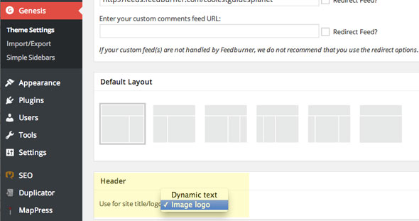
So if the Dynamic text is selected the text that gets used is another place – Dashboard > General Settings which is both the values for Site Title and Tagline.
If Image logo is selected things are a little different, what happens is that a default logo (as shown below) appears in the header with a background image set to the following CSS rule – .header-image .site-header .wrap which displays a 360x164px logo.png image.
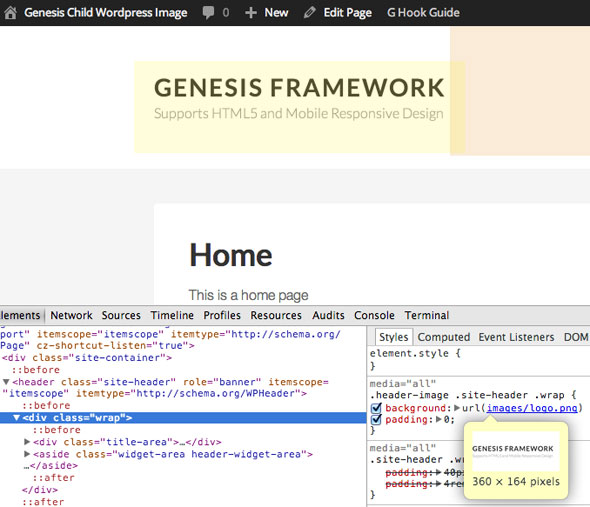
So what can be done is just to replace the logo with your own, and file it as logo.png in the child theme images folder replacing the existing one. Or remove that CSS rule and set the logo background to .title-area div.
The above settings may vary if you are using other Genesis themes which have had this behaviour modified.
Set the Full Width Responsive Image Header
Finally set the full width background image using the header element. The header element uses a CSS class of .site-header, CSS needs to be added to your style.css file like so:
.site-header {
background-image: url(/wp-content/uploads/2014/05/imagename.jpg);
background-repeat: no-repeat;
background-position: center center;
background-size: cover;
}
The image you use needs to be landscape in nature and pretty much around a minimum of 1400px in width as it is going to extend to some large monitor sizes. The key CSS rule to make it responsive is the background-size:cover; rule which will make the image cover different viewport sizes. How the image is positioned at different sizes is controlled by background-position in which you can focus on a part of the image on an horizontal and vertical position using top, bottom , center, left or right.
You can set a height for the header or let the height be determined by its contents. Setting heights in responsive designs can be problematic, start without and see how that design flexes at smaller sizes.
Set the Full Width Responsive Image Header for certain Posts/Pages
To set the responsive image to a particular page (similar to this page) you can use a custom CSS class just for that post/page by adding in the Custom Body-Class…
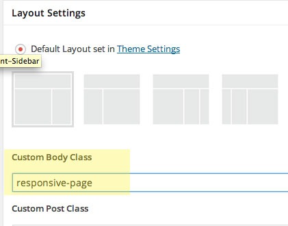
Just add a unique CSS custom class name.
Then adjust your CSS rules to appear just on that pages with that CSS class…
.responsive-page .site-header {
background-image: url(/wp-content/uploads/2014/05/imagename.jpg);
background-repeat: no-repeat;
background-position: center center;
background-size: cover;
}









23 comments
Jennifer
Hi there.
This works perfectly for me on desktop, but on Mobile devices, the image gets cropped. Using the Refined Pro theme. Suggestions for how to get around this?
Esther
Ah! Just realized that the header image is not a clickable link to open homepage. Any tips for this? Thank you!
Esther
I cannot thank you more. I have been struggling with this for hours today. God bless!
Esther
Ah! Just realized that the header image is not a clickable link to open homepage. Any tips for this? Thank you!
B
Worked like a charm, thanks!
Mark E
Hello! I am trying to put a custom header image into news pro theme and I can’t figure out how to adjust the height/width in my css. Any idea where that code would be?
THANKS!
Thank you for the write-up
Thank you for the write-up. I got the full-width header to work but I want both dynamic text AND a logo image to appear. I am having a hard time figuring out how to accomplish this. Any idea how this would be done? What is happening under the hood here to select either Dynamic Text or Image logo?
Cathy
Hi Neil,
Just want to let you know that I benefited from this tutorial. I am looking to reduce my plugins – Genesis Simple Hooks, being one of them. Your step-by-step is brilliant. Thank you so much.
Cathy
Neil Gee
Glad it helped Cathy!
Makena
Thank you for the write-up. I got the full-width header to work but I want both dynamic text AND a logo image to appear. I am having a hard time figuring out how to accomplish this. Any idea how this would be done? What is happening under the hood here to select either Dynamic Text or Image logo?
neelesh
i am using divi theme from themeforest.com for my website. can u pls tell me how to resize the fullwidth slider image as it appears to be to lagre and cover the whole page.well i am not a coder so please keep it simple
Neil Gee
Are you having a laugh
Randall
Hey Neil:
1. Thanks for taking the time to put this site together and share your insights. I think you are doing a great job explaining concepts that are difficult for those (including me) who are less experienced adjusting CSS, php, etc.
2. I incorporated the CSS according to your instructions above and it worked great!
3. I did experiment with design alterations which requires adjusting some style CSS, but purrs smoothly and is fully responsive.
4. I did make one alteration to the CSS you include above. I would like to know your thoughts:
.gppro-custom .site-header {
background-image: url(XXXX);
background-repeat: no-repeat;
background-position: center center;
background-size: cover;
}
Neil Gee
Thanks for the feedback Randall, I can’t see any difference to your CSS and the ones in the tut, anyway glad it worked for you!
Randall
Hey Neil:
I added “.gppro-custom” before .site-header
Not an important issue and there is argument for minifying the CSS by excluding this.
Are you familiar with a workaround for a site with viewport containers? If I implement the above CSS into News Pro theme, for example, it is contained within the the viewport parameters defined presumably in the child theme.
If you have a moment, please share your thoughts.
Walt Thiessen
I’m having trouble making this work with Genesis Dynamik. The background image goes off the screen both left-and-right. Any suggestions?
Neil Gee
I am not too familiar with Dynamik – do you have a URL with the problem?
Silver Fox
Thanks so much for the tutorial.
I followed the exact steps you outlined; unfortunately, however my header image is surrounded with white space and is shifted to the left of screen. Any suggestions on how I can get a full width header image in Genesis Sample Theme that is centered and not surrounded by whitespace, i.e. a header image which looks like the one in your tutorial?
Neil Gee
Do you have a link?
Silver Fox
My site is currently on a local testing server, and therefore not publicaly visible. I will look to transfer it to a publicaly viewable server and will post the link.
Thanks again for your great tutorial.
Xavier
I added:
.site-header {
background-image: url(/wp-content/uploads/2014/05/imagename.jpg);
background-repeat: no-repeat;
background-position: center center;
background-size: cover;
}
to my child themes style.css, replacing the old .site-header text but it just shows as transparent on our site. Am I missing something on this? – Genesis Education Pro theme in wordpress
kim
I am working on a site for a friend and I am experiencing the same issue. Using LifestylePro theme. http://www.thethoughtninja.com.
Neil Gee
It should work – I tested on Lifestyle Pro and was ok, I would need to see the site with the code added, the site you mention doesn’t have the CSS changes.