By default the Beaver Themer Sticky Header Option only sticks to the head for large devices only and disappears at tablet and mobile size – this makes for better UX but when the sticky header is minimal it can be useful at all sizes, heres how you can do it.
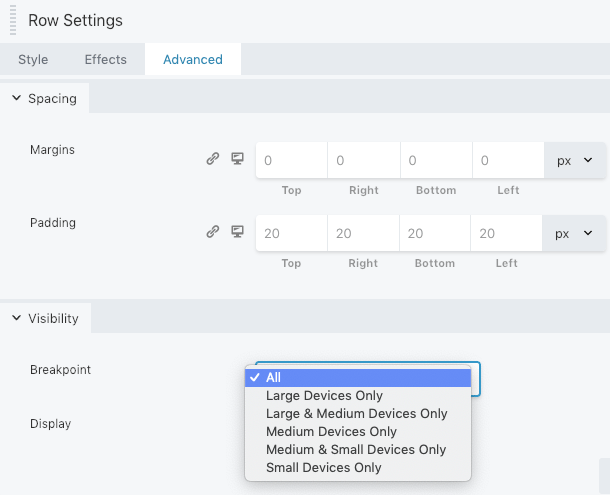
Make sure the row that the header is in is set for all devices
Add in the below CSS…
/* Allow Sticky Header */
@media (max-width:991px) {
	header[data-type="header"]{
		left: 0;
		position: fixed;
		right: 0;
		top: 0;
		width: 100%;
		z-index: 100;
	}


	.admin-bar header[data-type="header"] {
		top: 32px;
	}
}
So the the default media query that Beaver Builder uses 991px is used to show the header at that media query and lower – change this if you use a different size – I use 1024px. The second CSS rule just allows for the WP Admin dashboard header strip.
Another good practice is if the sticky header is just an icon row or a CTA such as a number you can set the rest of the header menu, logo etc as a Beaver Themer part and position that part after the header.
To change the default behavior of the Themer javascript of shrink and stick effects so it can appear at any viewport – see the js post.


6 comments
Robin
Can’t seem to get this working anymore
Frank Gomez
Missing “padding-top: XXpx” for hieght of element.
Mike Allen
Seems things have changed where there is no Responsive Layout option since this post was written. Do you have an update? Thanks.
Neil Gowran
The labels on the UI changed in the updates – I have since updated the screen grab showing the responsive layout options
Mike Allen
Thanks for the update!
Brian
thank you!! Was looking for this for a long time