How to use Slick Navigation menus in a WordPress theme, you can use the jquery responsive menus in any theme, this guide will use a clean default WordPress TwentyTwelve child theme, remove the existing responsive mobile menu used and use the slick navigation menus instead.
There is a Genesis version of the guide here. Also plugin available for download here.
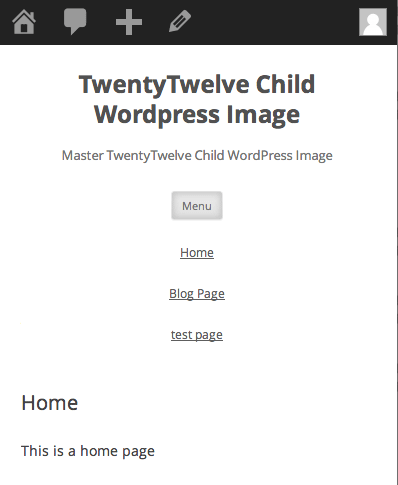
Removing Existing Mobile Menus
Remove Existing Javascript
//Remove 2012 Mobile Javascript
function de_script() {
    wp_dequeue_script( 'twentytwelve-navigation' );
    wp_deregister_script( 'twentytwelve-navigation' );
}

add_action( 'wp_print_scripts', 'de_script', 100 );
Add this to your child theme function.php to remove the existing javascript.
Remove HTML
Copy the parents header.php to your child theme and remove line 43.
<h3 class="menu-toggle"><?php _e( 'Menu', 'twentytwelve' ); ?></h3>
Move Menu CSS outside of Media Query
In the parent style.css file inside the Media Query targetting a min. width of 600px around about lines 1475-1549, copy and paste to your child themes style.css. This is pasted outside of any media query.
.main-navigation ul.nav-menu,
.main-navigation div.nav-menu > ul {
	border-bottom: 1px solid #ededed;
	border-top: 1px solid #ededed;
	display: inline-block !important;
	text-align: left;
	width: 100%;
}
.main-navigation ul {
	margin: 0;
	text-indent: 0;
}
.main-navigation li a,
.main-navigation li {
	display: inline-block;
	text-decoration: none;
}
.main-navigation li a {
	border-bottom: 0;
	color: #6a6a6a;
	line-height: 3.692307692;
	text-transform: uppercase;
	white-space: nowrap;
}
.main-navigation li a:hover {
	color: #000;
}
.main-navigation li {
	margin: 0 40px 0 0;
	margin: 0 2.857142857rem 0 0;
	position: relative;
}
.main-navigation li ul {
	display: none;
	margin: 0;
	padding: 0;
	position: absolute;
	top: 100%;
	z-index: 1;
}
.main-navigation li ul ul {
	top: 0;
	left: 100%;
}
.main-navigation ul li:hover > ul {
	border-left: 0;
	display: block;
}
.main-navigation li ul li a {
	background: #efefef;
	border-bottom: 1px solid #ededed;
	display: block;
	font-size: 11px;
	font-size: 0.785714286rem;
	line-height: 2.181818182;
	padding: 8px 10px;
	padding: 0.571428571rem 0.714285714rem;
	width: 180px;
	width: 12.85714286rem;
	white-space: normal;
}
.main-navigation li ul li a:hover {
	background: #e3e3e3;
	color: #444;
}
.main-navigation .current-menu-item > a,
.main-navigation .current-menu-ancestor > a,
.main-navigation .current_page_item > a,
.main-navigation .current_page_ancestor > a {
	color: #636363;
	font-weight: bold;
}
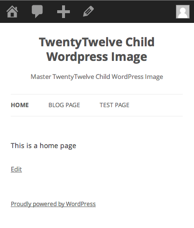
So now we have this:
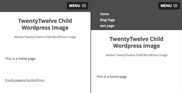
Adding in the New Slick Nav Mobile Menus
Add in the Javascript and CSS
Javascript
Download and extract the zip and get the jquery.slicknav.min.js , file this javascript file in your /wp-content/themes/YOURCHILDTHEME/js/ folder.
CSS
Also get the slicknav.css and file it in your /wp-content/themes/YOURCHILDTHEME/css/ folder.
function themeprefix_scripts_styles(){
wp_enqueue_style ('slickcss', get_stylesheet_directory_uri() . '/css/slicknav.css','', '1', 'all');
wp_enqueue_script ('slickjs', get_stylesheet_directory_uri() . '/js/ jquery.slicknav.min.js', array( 'jquery' ),'1',true);
}
add_action( 'wp_enqueue_scripts', 'themeprefix_scripts_styles');
This function and action loaded the core slick nav files and are added to your child function.php file.
Set the Slicknav to fire on page load
function slicknav_fire() {
$output="<script>
jQuery(function() {
jQuery('.nav-menu').slicknav();
});
</script>";
echo $output;
}
add_action('wp_head','slicknav_fire');
This is also added to the child function.php file and targets the menu with a class 0f .nav-menu
Fix CSS to show hide Mobile Navigation
The final piece is adding some CSS to your style.css file
/* .nav-menu is the original menu */
.nav-menu ul{
  display:none !important;
}
.slicknav_menu {
  display:block;
}
/*CSS Menu Style*/
  @media screen and (min-width:600px) {
  .slicknav_menu {
  display:none;
  }
  .nav-menu ul{
  display:block;
  }
}
Here I want the breakpoint set to 600px to show the mobile menu and hide the regular one – just adjust that value to your preference.
That’s it, there’s a bit more info on doing multiple menus and some javascript options on this Genesis/slicknav guide which is still relevant to all WordPress themes.


4 comments
Justin Hostetter
Thank you! This is such a great post and I learned a lot while managing to get this to work. A couple points of reference for others trying to use this tutorial:
1) In the most recent version of twentytwelve theme, step 2 (remove html) is now the following code:
2) In step 3, (Move Menu CSS outside of Media Query), the wording for the instructions confused me a bit. The code listed is INSIDE the media query in the parent twentytwelve style.css file and must be pasted into the style.css file in the child theme OUTSIDE of any media query.
3) In step 4, after installing js and css files, the code which must be copied into the Function file has an incorrect space: /js/ jquery.slicknav.min.js (should be /js/jquery.slicknav.min.js). This caused the action to fail.
4) In the final step, the newest version of twentytwelve uses ‘.main-navigation’ as the command, not ‘.nav-menu ul’ as described. I found it easier to use the following code:
.slicknav_menu {
display:none;
}
.main-navigation {
display:block;
}
/*CSS Menu Style*/
@media screen and (max-width:600px) {
.slicknav_menu {
display:block !important;
}
.main-navigation {
display:none !important;
}}
Hope this helps someone, and thanks again!
Derek
Very helpful notes. Thank you!
Justin Hostetter
Thank you! This is such a great post and I learned a lot while managing to get this to work. A couple points of reference for others trying to use this tutorial:
1) In the most recent version of twentytwelve theme, step 2 (remove html) is now the following code:
2) In step 3, (Move Menu CSS outside of Media Query), the wording for the instructions confused me a bit. The code listed above is INSIDE the media query in the parent twentytwelve style.css file and must be pasted into the style.css file in the child theme OUTSIDE of any media query.
3) In step 4, after installing js and css files, the code which must be copied into the Function file has an incorrect space: /js/ jquery.slicknav.min.js (should be /js/jquery.slicknav.min.js). This caused the action to fail.
4) In the final step, the newest version of twentytwelve uses ‘.main-navigation’ as the command, not ‘.nav-menu ul’ as described. I found it easier to use the following code:
.slicknav_menu {
display:none;
}
.main-navigation {
display:block;
}
/*CSS Menu Style*/
@media screen and (max-width:600px) {
.slicknav_menu {
display:block !important;
}
.main-navigation {
display:none !important;
}}
Hope this helps someone, and thanks again!
fran
Hello, is there a web site where this is implemented, so that we can see how it’s working ?