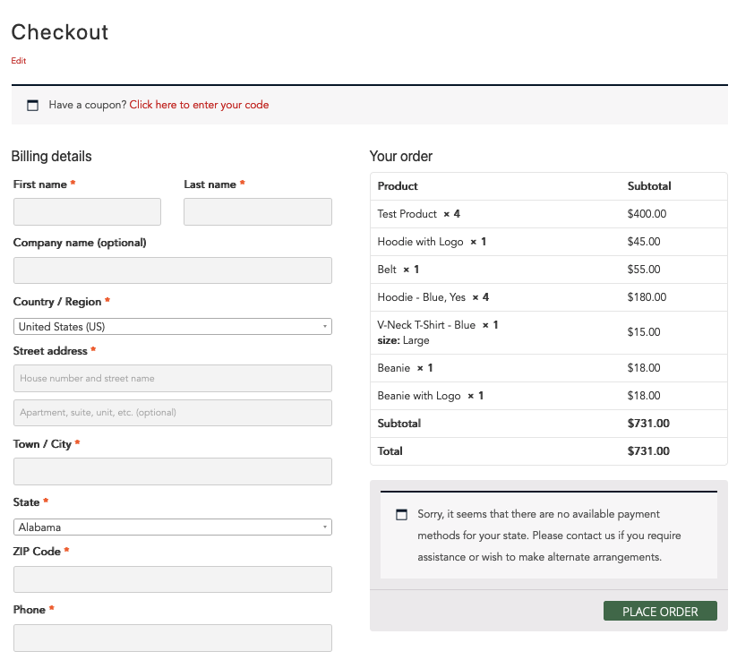
The default WooCommerce checkout page layout doesn’t make great use of a 2nd right hand column and looks a bit disjointed. Here is some CSS that can push the product order data to the 2nd column balancing the layout more evenly, making for a better user experience whilst checking out.
The CSS kicks in at over 768px, below that the layout is stacked.
/* 2 Column WooCommerce Checkout */

@media(min-width:768px) {
	.woocommerce .col2-set .col-1,
	.woocommerce-page .col2-set .col-1 {
		width: 90%;
	}

	#customer_details {
		display: flex;
		flex-flow: column nowrap;
		float: left;
		width: 50%;
	}

	#customer_details .col-2 {
		width: 90%;
		margin-top: 20px;
	}

	#order_review,
	#order_review_heading {
		width: 50%;
		float: left;
		clear: none;
	}
}
This WooCommerce Checkout Page CSS code works in the following WordPress themes:
- Beaver Builder Theme
- Generate Press
- TwentyTwelve
- TwentyThirteen
- TwentyFourteen
- TwentyFifteen
- TwentySixteen
- TwentySeventeen
- TwentyNineteen
(Both TwentyTwenty and TwentyTwentyOne have this 2-col WooCommerce layout by default).


2 comments
Anon
Thank you for this, works as intended
kelvin
Thank you for this. Very straight forward guidance. I just tweaked it a little and it worked on my Astra/Elementor combo.