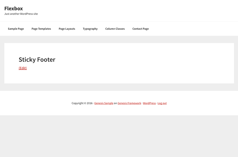
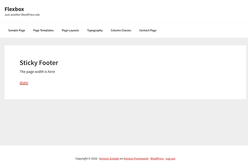
A sticky footer refers to a web page footer that sticks to the foot of the page even when there is not a lot of content on the page, without one the footer will ride up leaving the layout somewhat unsightly.
There are various methods to add a sticky footer, some javascript and others CSS, you can add a sticky footer to a Genesis layout with some simple flexbox rules.
/* Sticky Footer */

.site-container {
 display: -ms-flexbox;
 display:-webkit-flex;
 display:-webkit-box;
 display:flex;
 -ms-flex-direction:column;
 -webkit-flex-direction:column;
 -webkit-box-orient:vertical;
 -webkit-box-direction:normal;
 flex-direction:column;
 min-height:100vh;
}

.site-inner {
 -ms-flex:1;
 -webkit-flex:1;
 -webkit-box-flex:1;
 flex:1;
 width: 100%;
 padding: 20px 0;
 word-wrap: break-word;
}
This will push down the footer to the bottom of the viewport.
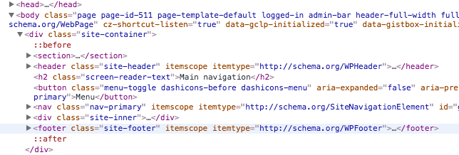
As long as the Genesis theme follows the default structure this CSS will work – so the site-container is the parent of site-inner and site-footer which are adjacent sibling elements as in the layout below.
Check with caniuse to add the most up to date required vendor prefixes. Flexbox is certainly the way to go in the future.
IE 10 & 11
*An issue arose in that this fails in IE10 & 11 and the container collapses – so the container needs to display as block in these browser versions – which you can target with…
@media screen and (-ms-high-contrast: active), (-ms-high-contrast: none) {

 .site-container { display: block; } /* IE10 & IE11 */

}
Safari
*Another issue arose with some older Safari versions, these are harder to target, you could inject a class via javascript…
Then apply CSS


3 comments
Tomas Risberg
I have tried your flexbox sticky footer, and it seemed to do its job well on Chrome 62 for Windows, but on Safari for iOS 11.1.1 on an iPhone 5S it breaks the responsive design of my Minimum Pro theme.
I would be most grateful if there was a solution to this problem, since I want a sticky footer solution that can work well with the Zotpress plugin for reference handling. Zotpress loads the references quite slow and the javascript based sticky footer I have used for years doesn’t know to wait until the page is completed by Zotpress. This will result in a non sticking footer on pages with more than two references.
Here is Sridhar Katakams Genesis sticky footer, the one I use for silent.se but want to change to something possible to combine with Zotpress
https://gist.github.com/srikat/046a3b9c5b0f8d9dc326
At silent.se I still use the javascript sticky footer. You can see that the responsive design works there, but if I add more references than two, then the footer will not stick any more.
Koen Adams
Looks like this is working really well!! Thank you. Best and easiest solution I’ve found so far :-)
jared
and yes! That worked well for me!