WordPress Underscores theme comes with a default primary menu that toggles to a mobile menu button at 600px wide. If your project requires using another mobile menu solution it is best to remove the existing one and here’s how.
You can disable this menu and behaviour by removing the wp_enqueue_script to the navigation.js file in functions.php
//wp_enqueue_script( 'underscores-navigation', get_template_directory_uri() . '/js/navigation.js', array(), '20120206', true );
Then in style.css tweak the menu section
Since the mobile button is now gone you can also remove the button mark up from header.php
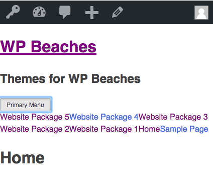
<button class="menu-toggle" aria-controls="primary-menu" aria-expanded="false"><?php esc_html_e( 'Primary Menu', 'underscores' ); ?></button>
Now you can add in another mobile menu solution without any conflict.


4 comments
Dalton
I’ve followed through this guide exactly, and now the menu bar is disappearing altogether at 599px. Do you know why that would be happening?
Neil Gee
Probably a CSS issue, make sure the edited CSS sits below or replaces the current style- issue maybe with a rule like this
@media screen and (max-width: 600px).main-navigation ul {
display: none;
}
If you have this then change none to block
PMRenault
Thanks for the helpful post. Do you have a suggestion for a replacement?
Neil Gee
Yes I use – https://wordpress.org/plugins/slicknav-mobile-menu/