By default when using Genesis Simple Share icons in WooCommerce products, the placement of these icons are not great.
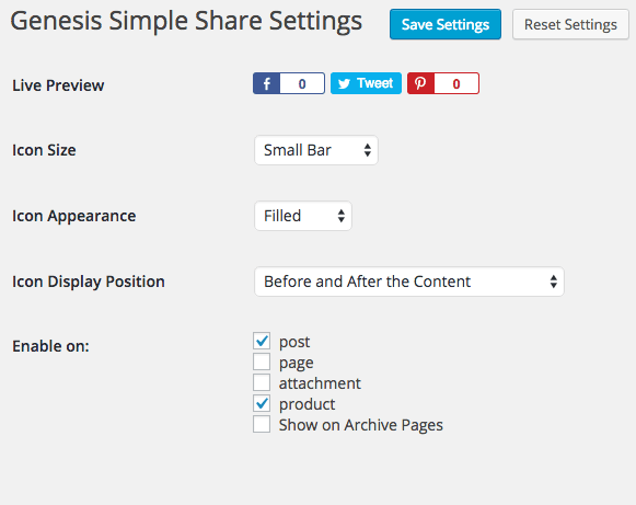
If you where to position the icons above or below the content in the Settings of Genesis Simple Share for WooCommerce Products, this is where they would end up…
In a regular WordPress post the placement is fine it’s the product where it’s not so hot.
To get these icons closer and in the actual product summary you need to use some WooCommerce hooks – when using hooks to position them you need to change a setting in the plugin to avoid having duplicate icons – select the setting “Select display position to enable icons”.
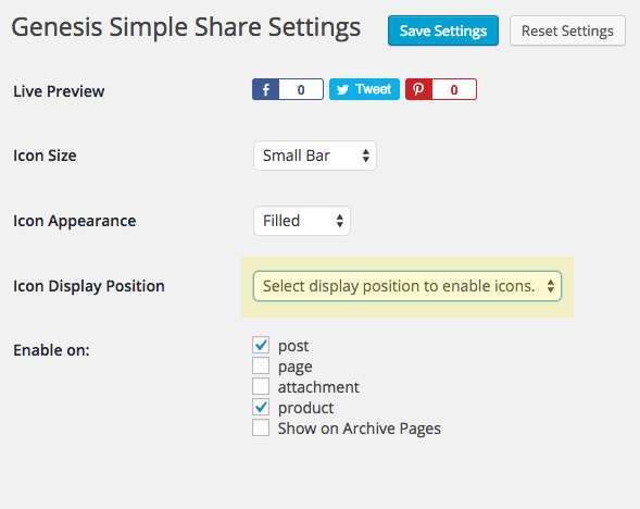
Hook in Genesis Simple Share with WooCommerce Actions
Now we can hook in the simple sharing icons with WooCommerce hooks, which there are many. In your functions.php you can add…
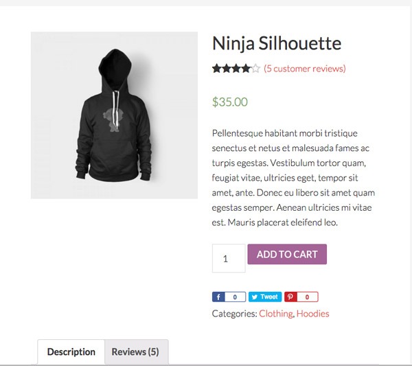
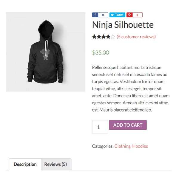
The woocommerce_single_product_summary hook is a decent one to use as you can adjust the priority number to change the position of the output, for example changing the number to ‘1’ will output the icons above the title.
Position the Simple Share Icons for Regular Posts
By doing this process, we now also have to hook in the Simple Share Icons for generic posts too, this time using the Genesis hooks.
This is similar code for the products, apart from now we are targetting posts with a Genesis hook

Adding the Simple Share Icons to WooCommerce Archive/Shop Pages
Finally you may also want to add the simple share icons to the shop or archive pages in WooCommerce
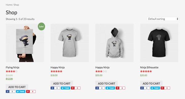
So here the woocommerce_after_shop_loop_item hook is used to position and displays the icons below the add to cart button, you just need to add some CSS for the spacing.
Some more info on Genesis Simple Shares and how you can selectively output certain share icons other than the default set.











3 comments
Tayshiro
Thanks! =)
Amber @ Au Coeur Design
This is great, thanks!
Patrick Fortino
Thanks a LOT for this detailed explanation. There have been a few times when I wondered about moving the simple social icons in a product page. Now I can.