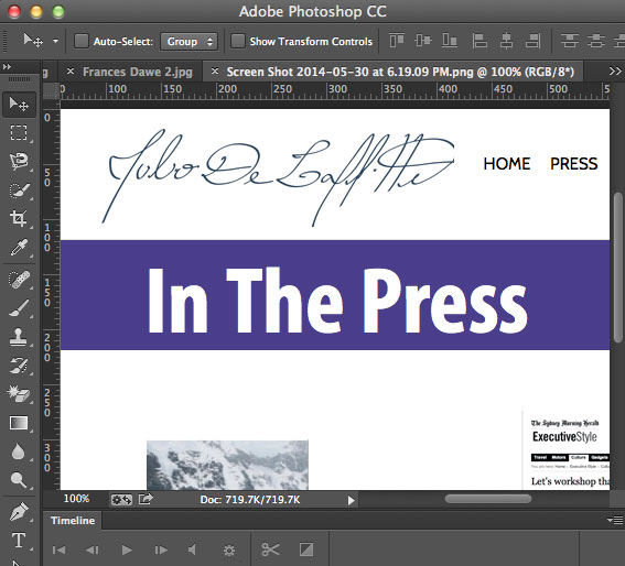
This layout calls for a full viewport width background color of the page title which is to appear on all pages, there are a defined amount of pages on the site with short titles.
To achieve this effect using the sample Genesis child theme you can take advantage of the .site-inner div
Change the CSS
.site-inner {
    background-color: #483B8B;
    height: 100px;
    max-width: none;
}
By changing the max-width value to none the element will extend to the size of the viewport whilst the height and background-color edits will give it shape and color.
.entry-title {
    color: #FFFFFF;
    font-family: 'Conv_MyriadPro-BoldCond',Arial,sans-serif;
    font-size: 85px;
    position: relative;
    top: -20px;
}
The second CSS rule takes care of the page title with the position and top CSS attributes moving the page title up into the colored .site-inner div.
This can also be applied to entry-titles for Categories.
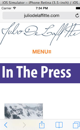
Dealing with Narrow Viewport
One issue that may arise is that if the title has a few words and viewed via a mobile device the line may wrap to 2 lines and if you are using white type – that type may disappear, the effect can be changed with a media query.
	@media only screen and (max-width: 600px) {

	.site-inner {
	max-width: none;
	background-color: transparent;
	height: auto;
	padding-left:0;
	padding-right:0;
	}
	.entry-title {
	background-color: #483b8b;
	padding: 2%;
	font-size:65px;
	}
	.entry-content {
	padding-left:5%;
	padding-right:5%;
	}

}
So in this CSS the .site-inner div is set back to normal with no padding to give it full width, and the .entry-title takes care of the background color and padding and the .entry-content now takes care of the padding for the rest of the content.


