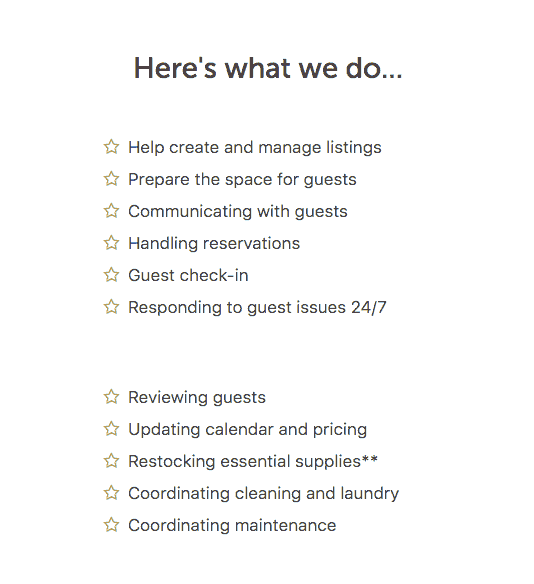
If you split 2 unordered lists into columns in Beaver Builder at desktop size, the results will look a little uneven at the smaller viewport on tablet or mobile.


You could create a duplicate of the module and show/hide based on viewport or you could fix in CSS by adding a CSS class to the modules with the unordered lists in them – in this case .split-list
@media only screen and (max-width: 768px) {

.fl-builder .split-list ul {
 margin-bottom: 0;
 }

.fl-col-small .split-list .fl-node-content {
 margin-bottom: 0;
 }

.fl-col-small + .fl-col-small .split-list .fl-node-content {
 margin-top: 0;
 margin-bottom: 20px;
 }

}
The CSS works best when there is 2 modules initially side by side then when below 768px – it will remove the margin at the bottom of the list and .fl-node-content but retain a margin at the top of the first module and at the bottom of the second.


