Here is a quick tutorial on how to create a blog post layout that has a checkerboard style layout which uses a featured image on one side of the the post and the post headline and content on the other, the image alternates position on each post.
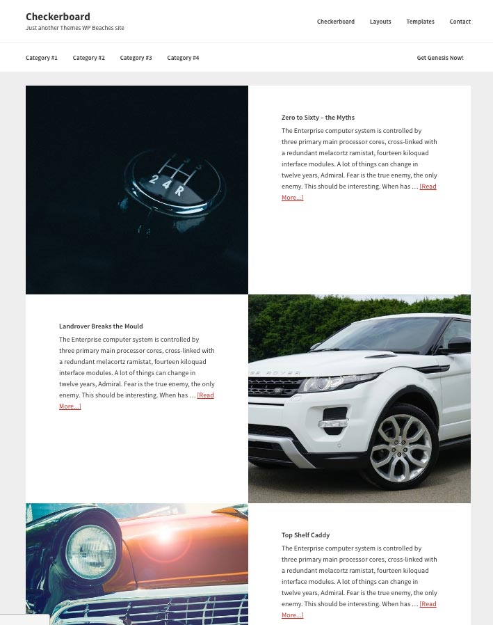
This is similar to the Atmosphere Pro theme layout which does the layout with three pages using the Genesis Featured Page widget, this tutorial uses the Genesis Featured Post Widget.
The images are best suited cropped in a square ratio. The images used in this tutorial are initially uploaded at 64opx wide
Adding in via a Widget
Using the Genesis Featured Posts Widget you can add the posts in to an existing widget, you can set the amount of posts to display as much as you like.
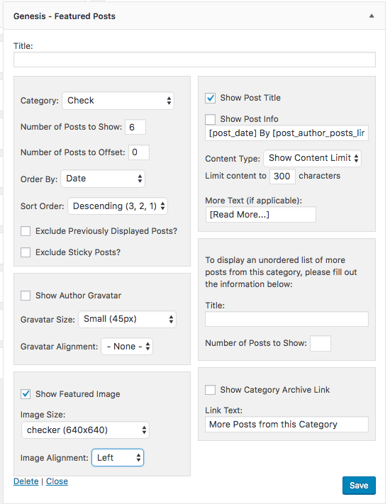
So here, I have selected my category ‘Check’ for my posts and am selecting 6, the featured image is set to display initially set to Left for the alignment, but this will be overridden in the CSS, the post title shows and has a content limit of 300. It’s important to keep the content limit to a reasonable amount as otherwise the layout will struggle at smaller sizes.
The CSS
The key thing in the CSS is to use your widget name CSS class (mine is .home-top), I am also using mobile first media queries. The image is contained in a link at 50% and the header and content are also set to 50%, their float positions are set to left with every 2nd linked image floating right.
The image height has a fixed px setting to retain the shape but its width will change according to what width is available, when viewed at a mobile style size I think it’s better to reduce the height, initially I set it at 600px but change it to 360px at a smaller px size.
