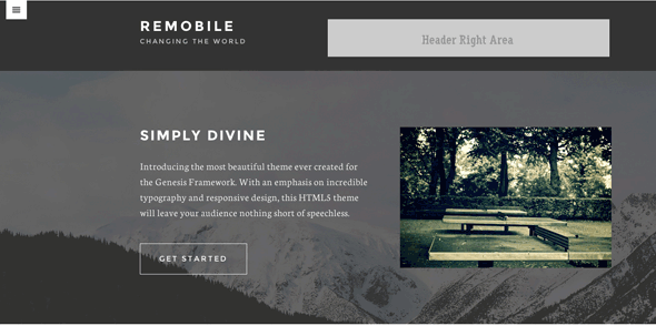
By default the header widget area in Genesis Remobile Theme is unregistered but can be simply registered back in for use.
This guide looks at rearranging the header area in Remobile to have the header-widget area included back in, and also put the menu on the left and less margin and padding in general. So the desktop version would look like…

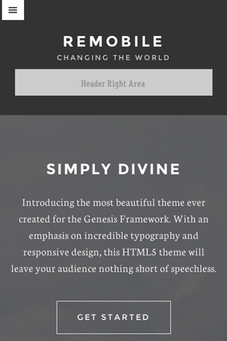
and smaller size looks like this…

CSS
/*
Header Right and Title Area
---------------------------------------------------------------------------------------------------- */
#menu-primary-navigation {
	text-align: left;
}

.title-area {
	width: 35%;
	float: left;
	padding: 0 2% 2% 0;
}

.header-widget-area {
	width: 65%;
	float: right;
	min-height: 100px;
	color: #fff;
	padding: 0 0 2% 2%;
}

.responsive-menu-icon {
	float: left;
	margin-left: 1%;
}

.site-header {
	text-align: left;
	padding-bottom: 0;
}

.site-title {
	margin-top: 0;
}

.header-image .site-title {
	margin: 0;
}

.header-image .site-title > a {
	margin: 0;
}

/*
Media Queries
---------------------------------------------------------------------------------------------------- */

@media only screen and (max-width: 1200px) {

	.headwrap {
		padding-top: 20px;
	}

}

@media only screen and (max-width: 767px) {

	.header-widget-area{
		width: 100%;
		padding: 2%;
		margin: 0 auto;
		text-align: center;
	}

	.title-area {
		width: 100%;
		float: left;
		padding: 2%;
		text-align: center;
	}

}
Add this CSS into your style.css
PHP
In functions.php look for and delete/comment out the header-right widget area where it is unregistered
//* Unregister the header right widget area
//unregister_sidebar( 'header-right' );
//Adjust Header

//Add a wrap around the title and header widget area
function themeprefix_header_wrap () {
	echo '<div class="wrap headwrap">';
}
add_action( 'genesis_header','themeprefix_header_wrap', 5 );

function themeprefix_after_header_wrap () {
	echo '</div>';
}
add_action( 'genesis_after_header','themeprefix_after_header_wrap' );
And also add this into your functions.php – this alters the HTML mark up around the title and and header widget area.
A div is wrapped around the title and header widget area and given a .wrap class so the content stays in alignment with the content below, it also has a custom .headwrap class added for other unique CSS styling. The opening div is given a higher priority of 5 so it is added before the title and header-right areas, the closing div is added after the header.


1 comment
Dom
Thanks for the help, I like the idea. Although I gave this a shot on my personal site but the Header info stayed centered. Any advice?