So you have got your web layout flexing and changing layout in a fluid or responsive web layout – but the images are not quite working they are being stubborn and not scaling and moving around like the text!
The reason is because the images most probably have a fixed width which the web layout is honouring, so for example in your source code your image may have a tag like so:
<img src="images/my-image.jpg" alt="why is my image not scaling" width="590" height="420" />
So here the image above on a Mobile device in either portrait or landscape orientation will not scale responsively in the viewport at the correct width; for Apples iPhone its viewport is 320px portrait or 480px landscape, so images will display at their fixed size and the user on the mobile device, in the image example above they will have to scroll/swipe to see the full 590px of width – but the idea of responsive layout is to scale all the content into the viewable viewport without having to scroll width wise, it’s Ok to scroll (swipe) in a depth orientation so the height doesn’t really matter.
So how to fix?
Instead of assigning an absolute width value via a HTML attribute in the tag of an image, assign the CSS rule max-width that targets the image as a percentage relative width value like so:
img {max-width:100%}
What this will do is make the image display 100% of its size within its parent element available width space.
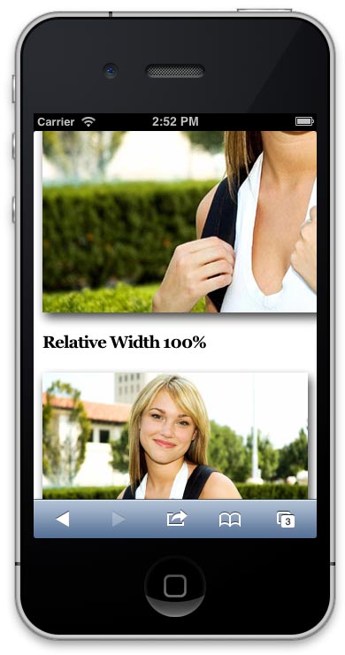
So to illustrate this, below are 2 images of the old favourite parked domain girl, one with a defined width in pixels (590px) the other in a relative width as a percentage (100%).
Fixed Width 590px

Relative Width 100%

Start to make the browser window narrower and watch the bottom image scale and top one remain the same size. The bottom one is scaling to 100% of its parent element which will change depending on the width of the viewport in a responsive design. For a better observation check this page on an iPhone.

So all other elements without a fixed width but rather a relative width will fit to the viewport .
So best practice would be to optimise the image at the largest size required, then set a CSS selector which targets the images and includes the {max-width:100%} rule and also ensure the width attribute is not in the html.
There are some new solutions being considered which serve different size images according to the user agent requesting them however these are not currently supported, this will be a step forward when it is ready as it will cut down on delivering full size images to be scaled on mobile devices.
You may well have a site that is littered with images with fixed widths, here are a couple of solutions to fix those.
Also here is a handy utility to see if your site is acting responsive for tablets and mobile devices.


14 comments
Edward
If you set width:auto, it will automatically adjust the height as well.
Jason
You forgot height:auto
Sameer Khan
Nice Work Done.
Jake
The code you used for the first example has
style="min-width: 590px !important;"in it, which is what prevents the resizing in smaller browsers. Once you remove that line of code it resizes fine.Flickers
Thanks alot, really helpfull, worked fine and perfect for me.
Stephanie
How does this work for header images?
deavenditama
thanks, it’s work on my website..
GCDS
Yeah, well, works just fine for me. Saved me a lot of trouble while woking on a website. Thanks for a nice tip.
Saldy Tallawan
thanks, it works! :)
this is what I did:
#midcontent{
margin:auto;
max-width:60%;
}
#midcontent img{
max-width:100%;
}
Doesntworkforme
This doesnt seem to work for me…
Lorraine’s example doesnt work:
to
does not work
anyone have the correct syntax at all?
Thanks
hoasenvang
That’s great. Simple way image auto scale in responsive mobile theme..thanks
santhosh s
i put max-width 100 also not working
Lorraine
I had the same issue for ages when I was doing my website. I luckily stumbled upon this site and my issues have now been solved! You change it in the section that holds the information of the original image size that was uploaded. For example: <img alt="Discount Offer" src="http://www.yourwebsite.co.uk/image/data/Mini_10_Discount.png" style="width: 380px; height: 240px;"
All you do is literally swap over the section that has, "width: 380px; height: 240px;" and put in the code: "img {max-width:100%}". There is nothing else that you need to do or change.
Next, you can test the images by going to any website that allows you to view your site on different devices and then you will see that all of the images will then conform to whatever device that its viewed on. Just remember to go through all of the pages of your site and change that code section on your images in Source Code viewing mode. I hope that I explained it OK. :)
Jan-Olof Eriksson
Thanks, this was great tip!